Design System Redesign
A complete visual, functional, and technical overhaul of the Lilly design system.
Role:
Senior Visual Designer
Platform:
Web
Timeline:
Dec 2023 - Jan 2025

Overview
After several years applying the Lilly design system (LDS) across dozens of websites for the Enterprise Website Initiative (EWI), I joined the LDS team to help redesign the system itself. I brought a deep knowledge of the system’s limitations, its users, and the regulatory challenges brand teams face. My role focused on component redesign; auditing, researching, designing, and spec’ing out each component to ensure consistency and improve functionality while meeting rigorous accessibility and regulatory standards. These updates aimed to deliver a seamless and inclusive experience across all platforms and devices.
The Problem
Eli Lilly has hundreds of internal brands and departments, each with their own unique design needs and requirements. Each brand/ department had their own design teams or hired external agencies to produce content and build applications. This approach was expensive, labor-intensive and inefficient. While an internal design system existed, it lacked the flexibility and depth required to support the diverse needs of these teams. To address these issues and increase adoption across the company, the system needed significant improvements.
At the same time, Lilly was undergoing a broader brand transition to become more customer-focused. This had leadership brining in a new incubation design team with a fresh perspective to try and modernize the overall look and feel of its digital presence. These visual concepts would need to be translated into usable, scalable components that would meet all accessibility and regulatory requirements.
01.
100+ Product teams
lacking system support for their project needs
02.
Inflexible components
lack the depth to support current and future projects
03.
Slow development
from dated documentation and breaking components to add customization
04.
Goals
Increase adoption rate of the design system across the company
The primary goal of the LDS 2.0 refresh was to improve and expand the design system to increase adoption from more internal teams at Lilly. This would involve enhancing component usability and flexibility, introducing new product-oriented and AI-oriented components, and making improvements to both the documentation and Figma library.Modernize the systems look and feel
Utilizing another internal design team's concepts we would need to redesign each component to update its look while maintaining compliancy and accessibility.Improve the implementation of the system for the designers and developers
Lilly original library was built in Sketch and later migrated into Figma without a full redesign. The result was an incomplete and poorly optimized library that created friction for both designers and developers. We needed to restructure and rebuild the system into a new Figma library that would streamline implementation, provide better tooling for designers and improve overall usability.Improve the user experience across each component
As the primary component designer for the project I wanted to make sure that every component I worked on delivered a better, more intuitive, and cohesive experience for the end users. I would enhance usability, accessibility, and functionality across every component within the system.
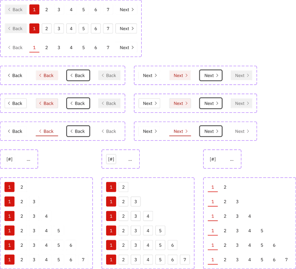
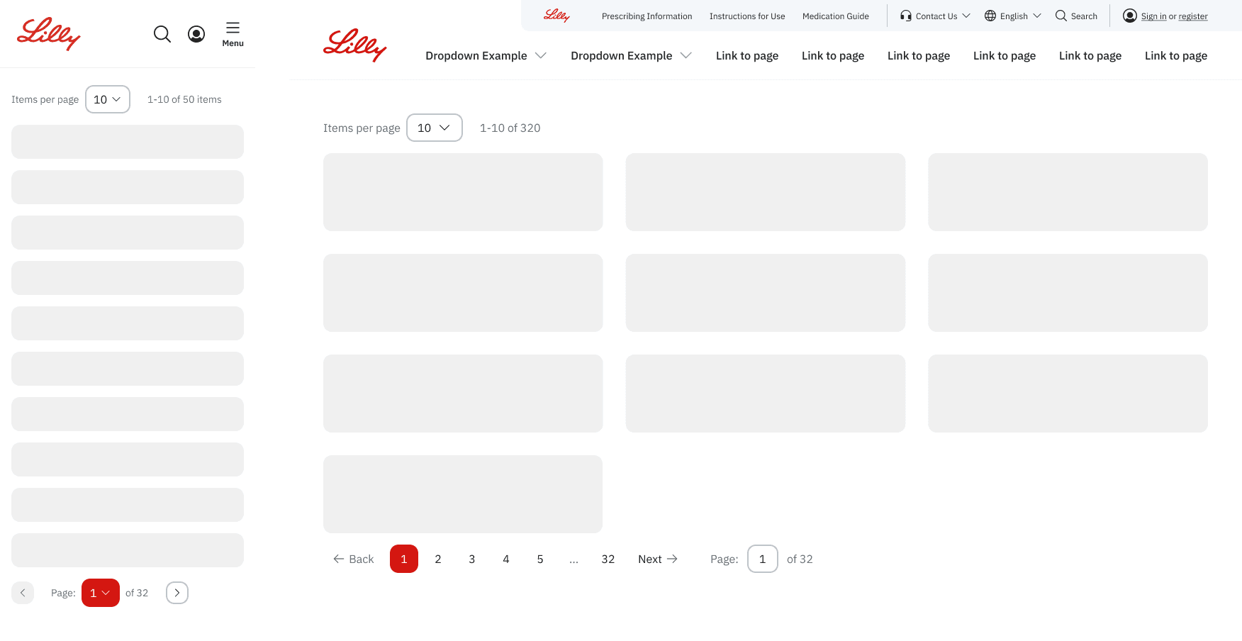
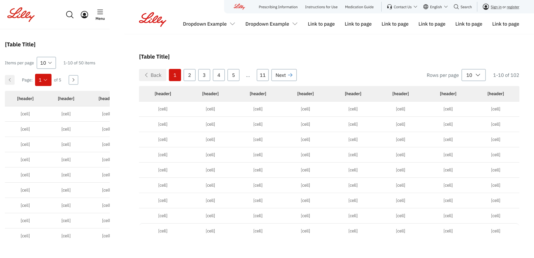
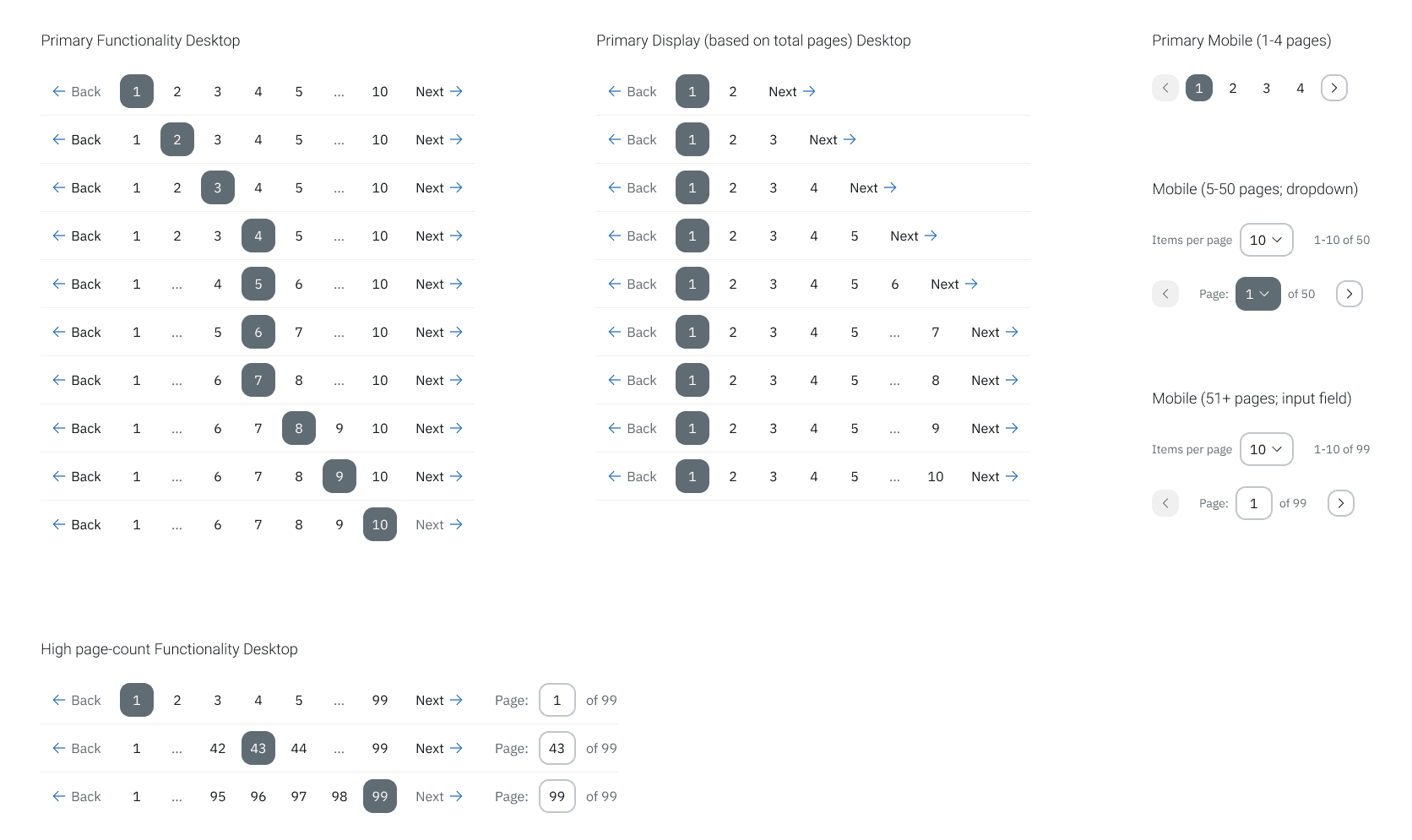
From LDS 1.0:
LDS 1.0 Pagination component
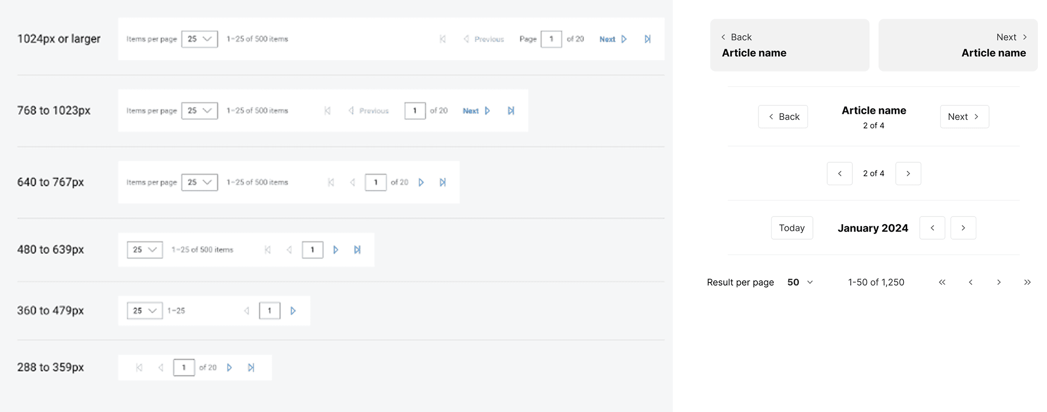
To LDS 2.0:
Mobile

Desktop
LDS 2.0 Pagination component
Impact
The LDS team successfully launched the Lilly Design System 2.0 in august 2024. We were able to achieve all of our core goals as well as additional accessibility and compliance objectives that were added as the project progressed.
Designers appreciated the new Figma library with its detailed component options, nesting and theming capabilities, and responsive behavior that all enabled them to work entirely within the new system (the library even received praise from Figma's internal design system team).
The updated design systems governance and component documentation improved implementation time and reduced decision fatigue by ensuring correct usage, addressing accessibility, and providing structured design guidance.
Accessibility enhancements were prioritized and baked into our core components to ensure WCAG AA compliance across the system.
The Approach
Our team developed a clear and efficient process to take each component from assignment to its release. We worked in bi-weekly sprints to research, define, design, review, build, and release. My job was focused on the first three steps: researching, defining, and creating the visual design.
OUR DESIGN PROCESS
01. Research
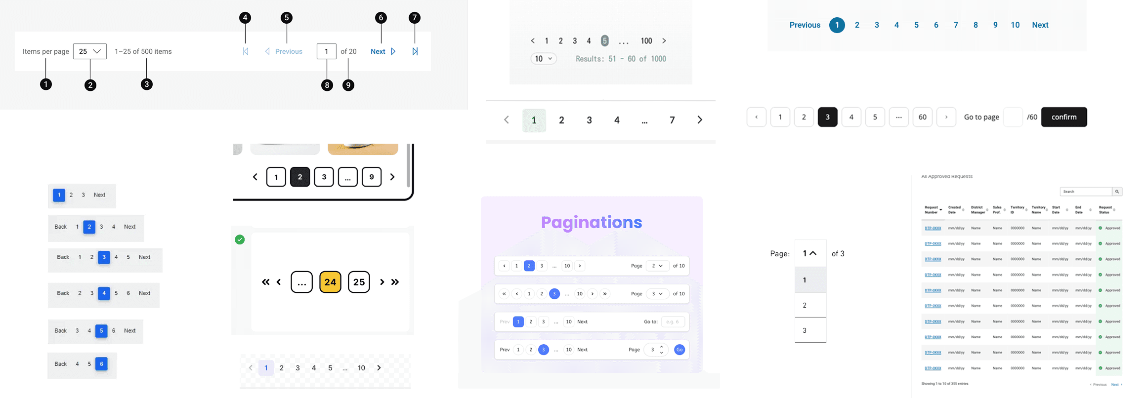
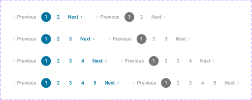
Visuals from my competitive analysis for the pagination component
02. Define
During the define step I take everything that I've learned from the research phase and plan out what this component update is going to look like.
Initial planning
List out all stakeholder requirements.
Think through how I might be able to improve the component. What would it look like in a best-case scenario with unlimited time? How can I scale it back to fit our needs?
Decide what is going to be MVP, and what will need to be updated or added for a future release.
Defining the component
List out every single aspect about the component that I can think of. The functionality, variations, sub-components, etc.
Write down questions for problems that will need to be solved. How will it handle different screen sizes? How will the various states look? Is this accessible?
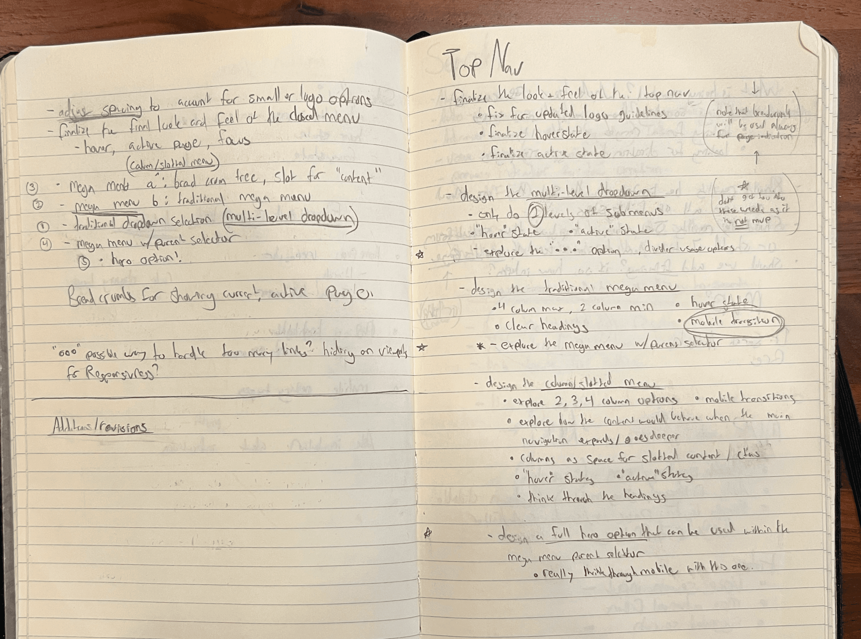
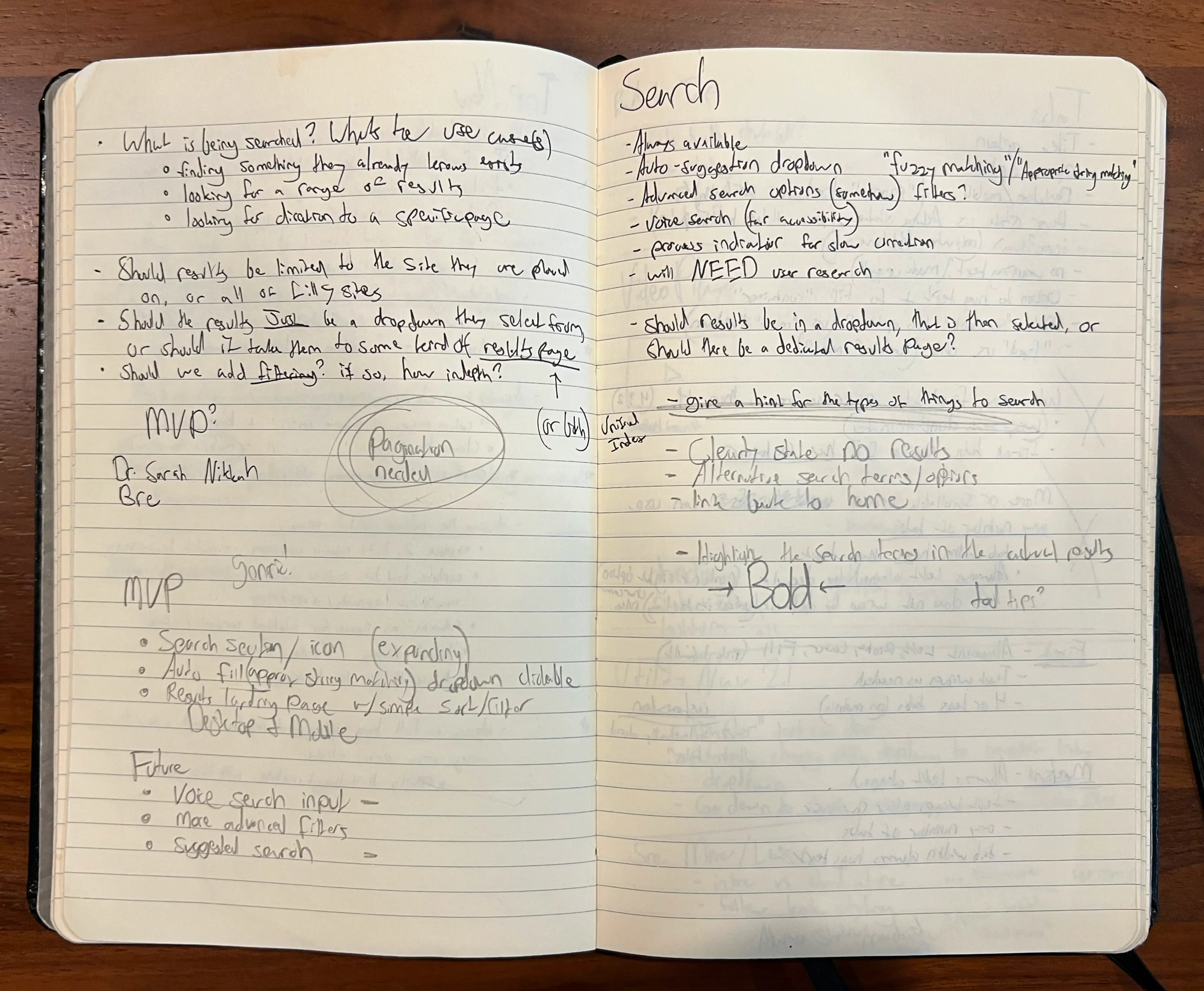
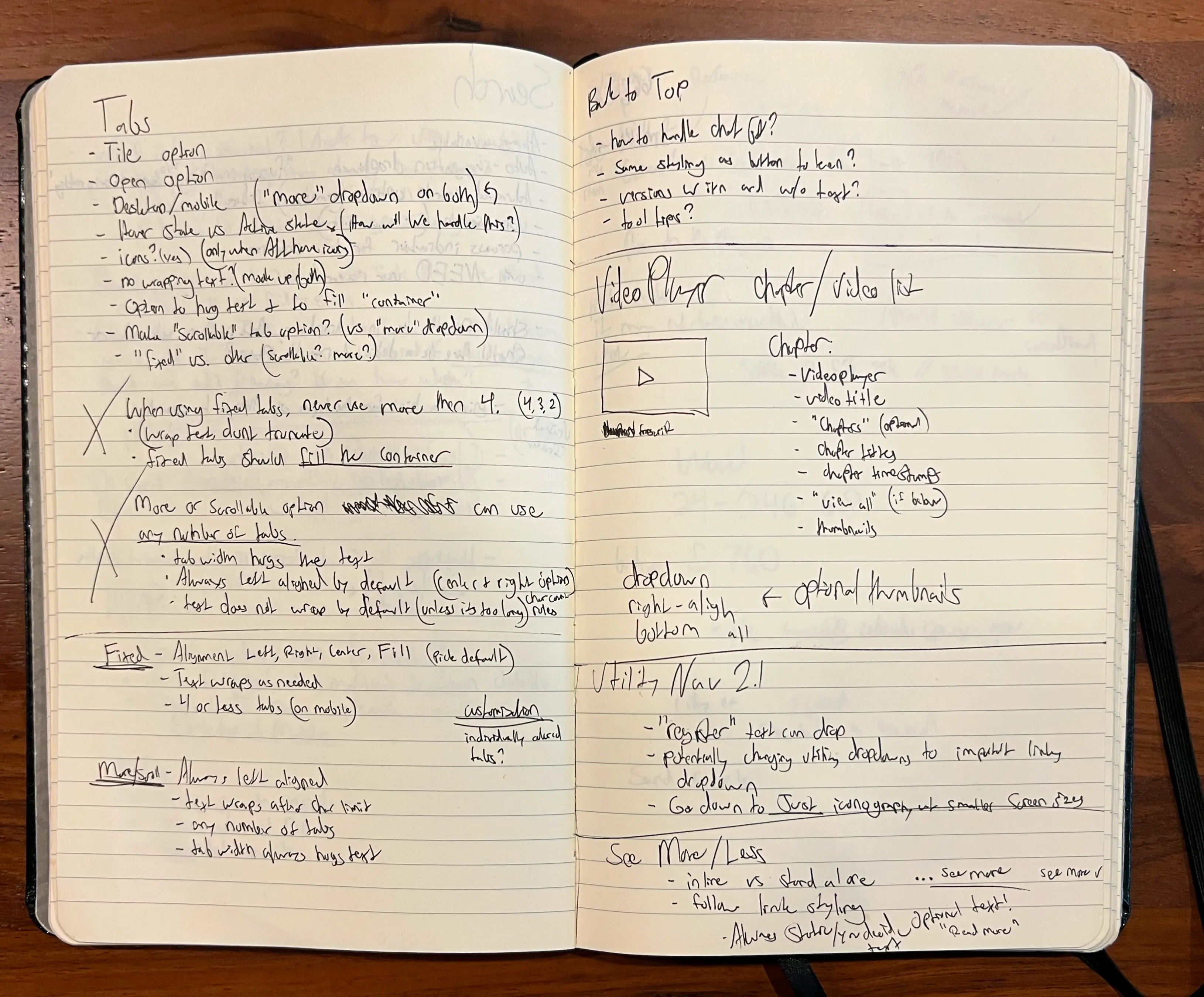
Initial notes on how I'd plan to break down the component and its functionality
03. Visual design
At this point I begin my design process. I take the research and my notes and start plugging ideas into Figma. My goal is to get all of my ideas for the look and feel, functionality, and possible variants out of my head. I then refine and iterate until I have a design I am ready to move forward with.
While working out the design I am asking myself a variety of questions to help it get to the best place it can be. Some of these questions look like:
How all of its sub-parts will be working together?
How it will behave responsively?
How the user will be interacting with it, does it align with the research?
Have all the states for its interactivity been considered?
Have I utilized accessibility to improve the usability?
Would this component be obvious/ enjoyable to interact with?
Does it seamlessly align and fit with every other component within the system?
Once the design has been refined, I break it down into all of its sub-parts and make sure those parts are all clearly defined and ready to be reviewed/ build out.
A breakdown of everything involved in one of the of the video player components
After the design is complete I go through and add in all of the notes for documentation. These notes are intended to give our developers and designers all the information they need to build out the actual component. They also document how to handle edge cases and best practices for utilization.
After documentation, it's time to stress test. To make sure that the component will be compatible within any application and at any screen size, I test every edge case that I can come up with. Long text, extreme inputs, globalization, screen sizes, orientation changes, etc.
I make sure that the component will work for every breakpoint that we test for. This ensures correct functionality, as serves as a visual for the dev team when they build out the react.js component.
04. Asynchronous review
When the initial visual design is complete other members of the design team independently review the work. The goal for the reviewer is to make sure that everything is pixel perfect, accessible, responsive, and ready to go by following an extensive checklist.
✅ Review stress test checklist:
1. Visual consistency
2. Accessibility
3. Interactivity
4. Responsivness
5. Edge cases and Scalability
6. System Compatibility
While the component may not be 100% ready for handoff during the initial review, comments and suggestions are left for the original designer to go back and fix before we review the design as a team.
05. Team design review
This is a chance to walk through the design and have the team provide live feedback to align on design and functionality to get the component wrapped up and ready for the stakeholder review.
We walk though every aspect of the component
Discuss and align on functionality
How does this component behave, are there any new features or functionality?
What is going to be MVP, what can be a future feature add-on?
Does the component meet or succeed all of the stakeholders requirements?
Make design decisions
Are we aligned on the look and feel? If multiple options are presented, decide on the visual or functional design.
If we cannot align, give the component options to the research team to perform user testing.
Close out all existing comments
Have all of the comments from the asynchronous review been addressed?
Are there any outstanding concerns that need to be discussed?
Align with Developers
Is the final component design able to work within the constraints of the code-base?
Will there be any issues with compatibility, theming, or any other concerns while building out the component?
After the review the component either moves forward to the stakeholder review, or goes back to the designer to make any final revisions.
06. Stakeholder review
During the stakeholder review we present the component in its current state to our primary stakeholder. The goal with this review was to both have an outside set of eyes look thing over to make sure that nothing was missed, as well as sign off/ approval so that the component can be built out and added to the system.
If revisions need to be made, the component goes back to the visual design phase. Otherwise, we have the green light to build out the component into our two libraries.
07. Component build-out
At this point, the original design is handed off to another designer to build out the Figma component, and the dev team to code it into the library.
Figma component library
A second designer works with the initial design specs and documentation to build a robust Figma component.
The component is tested and reviewed with a similar process as the primay design and then added into the Figma library.
Codebase component library
The dev team takes the speced out designs and builds them into a react.js component.
Communication was open between teams to answer any questions or if anything was missed in the initial documentation.
The finished component goes through its own separate review process.
Example LDS button Figma component built out by Dan Heflin, another designer on the project.
08. Release
Challenges
Changing timelines leading to inconsistencies and rework
Initially we were given three months to deliver an MVP for the 2.0 upgrade. That timeline was later extended to nine months, then shortened again to six. The uncertainty, driven by internal politics and the high-visibility of the project made it difficult to follow a structured, scalable design approach.
Locked into specific design choices
Because an incubation team was hired to come up with the visual concepts, we were required to translate and adapt those designs into the upgraded system. While some of their concepts were fresh and innovative, the majority lacked polish, cohesion, and consideration for regulatory constraints.
Scaling back ideas for MVP
As I was researching and designing components I would often design beyond MVP to add in new features, more customization, and enhances to the user experience. Unfortunately, due to the strict timelines, many of these ideas had to be deprioritized and set aside for future iterations.
Future steps
After successfully launching the LDS 2.0 MVP, our focus is shifting towards incremental improvements and updates. We plan to revisit some of the earlier components to better align them with the newer work, as well as incorporating the non-MVP enhancements originally scoped for future phases.
While LDS 2.0 MVP was a major leap forward, specifically for teams working on internal products and applications, the system still lacks support for data visualization. Our next goal is to conduct interviews within internal teams to understand their needs and explore what a comprehensive data visualization library could look like within the system.
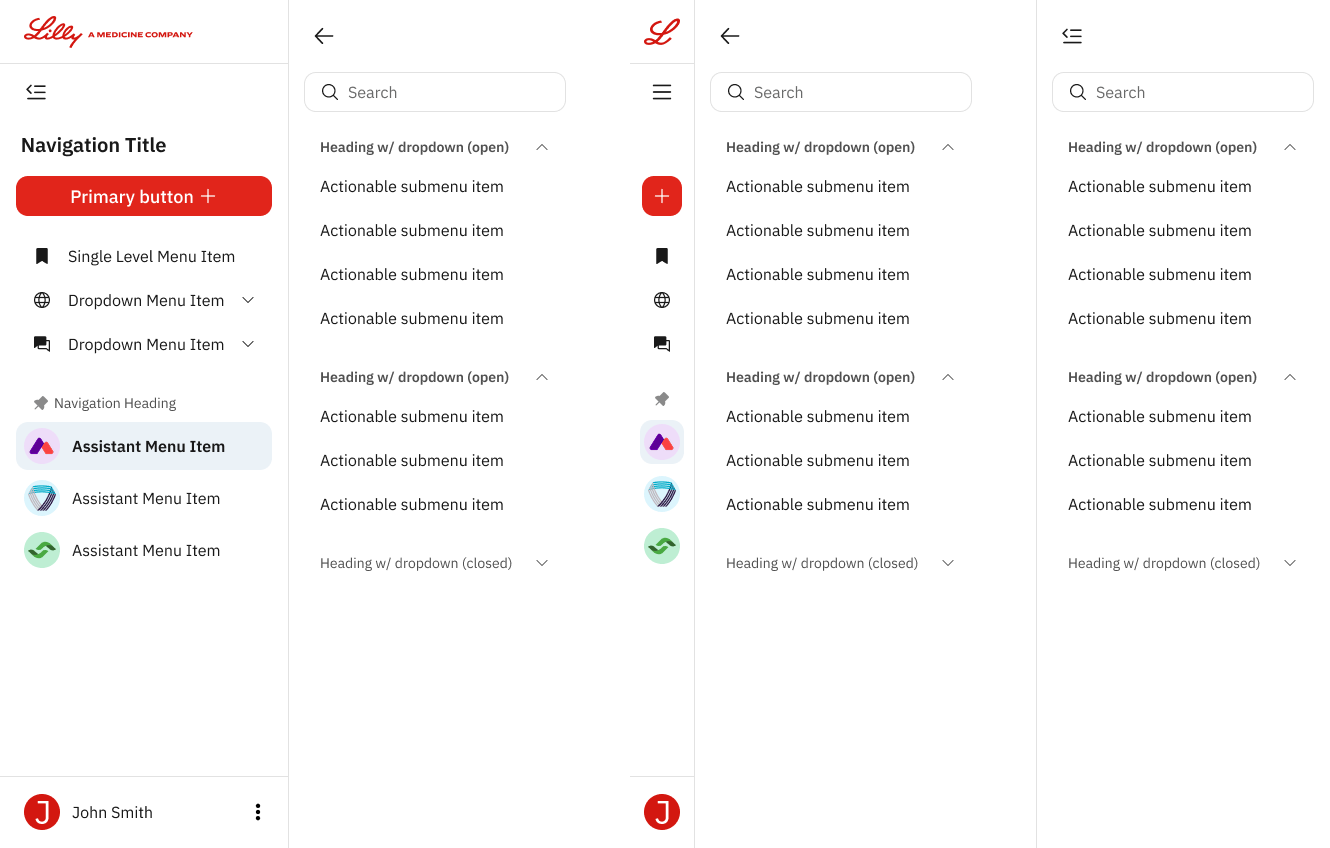
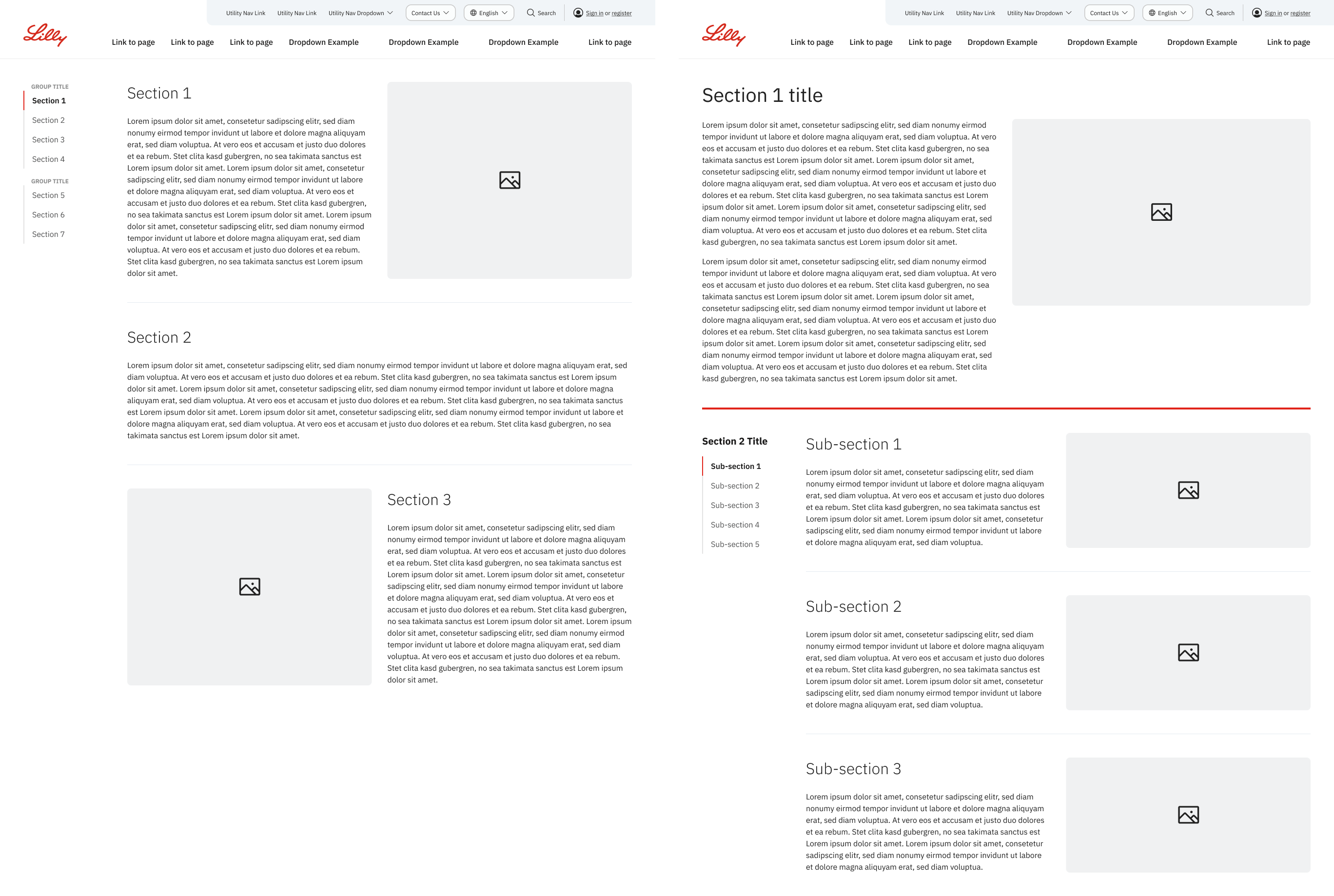
LDS 2.0 COMPONENTS
Some of the components I designed during my time on the LDS 2.0 redesign project.
Pagination
Drawer
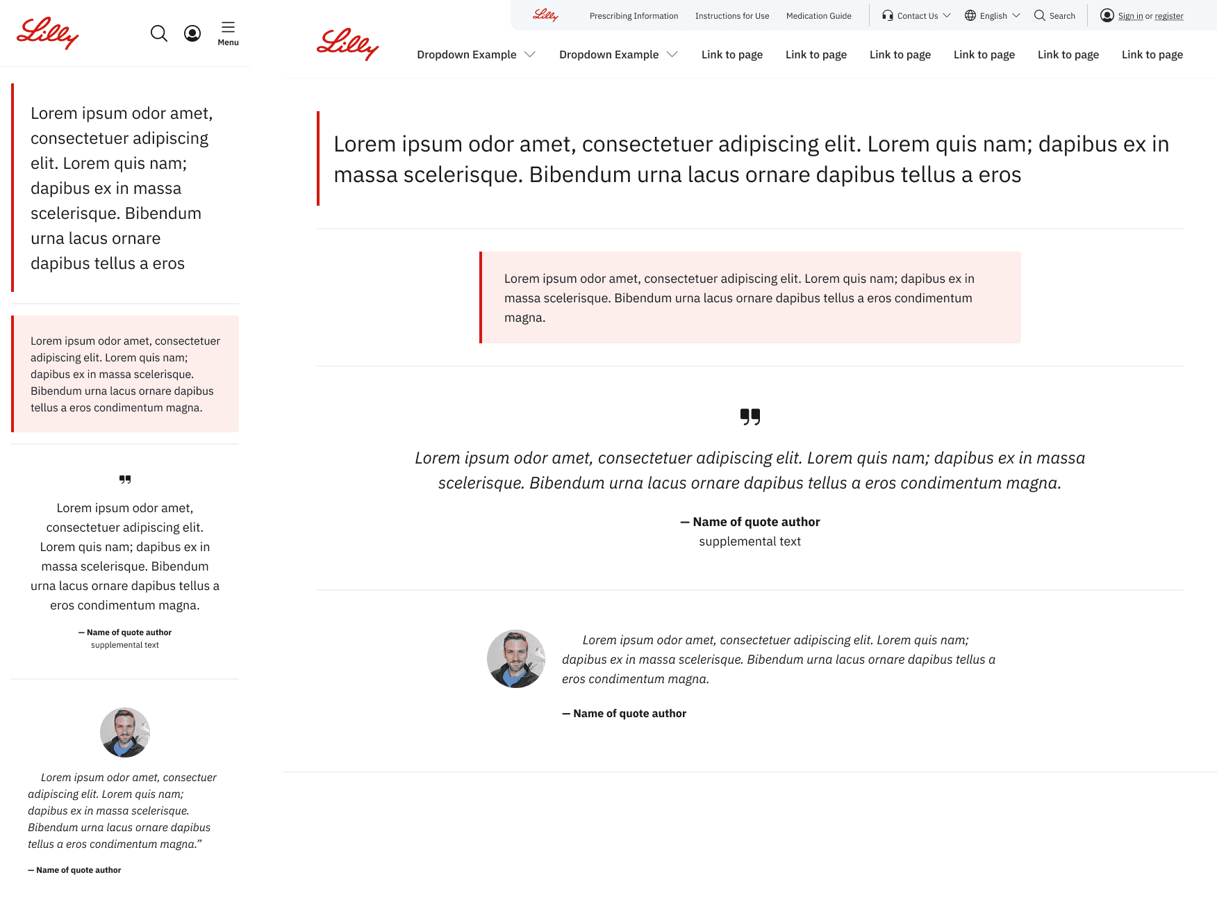
Blockquote
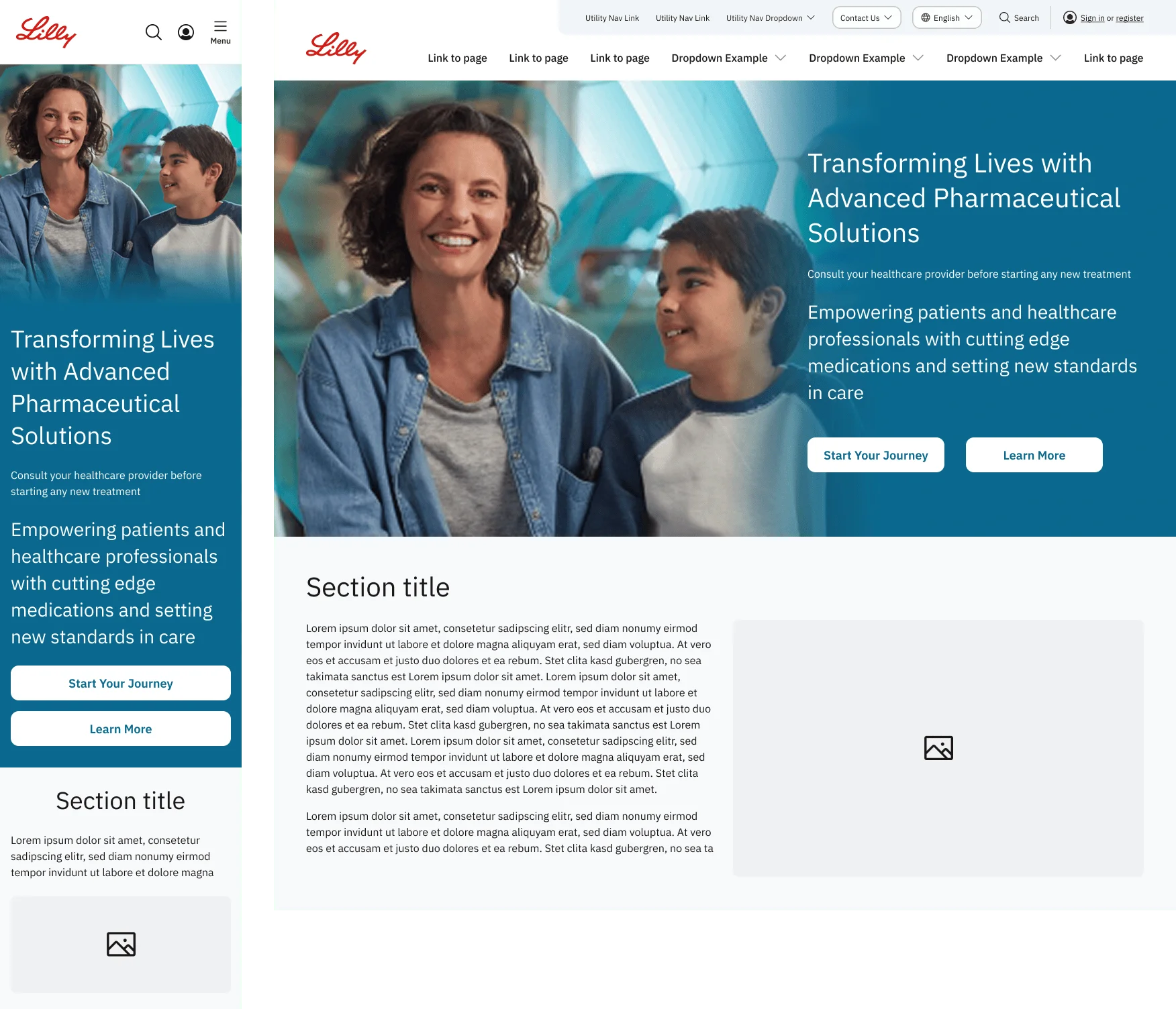
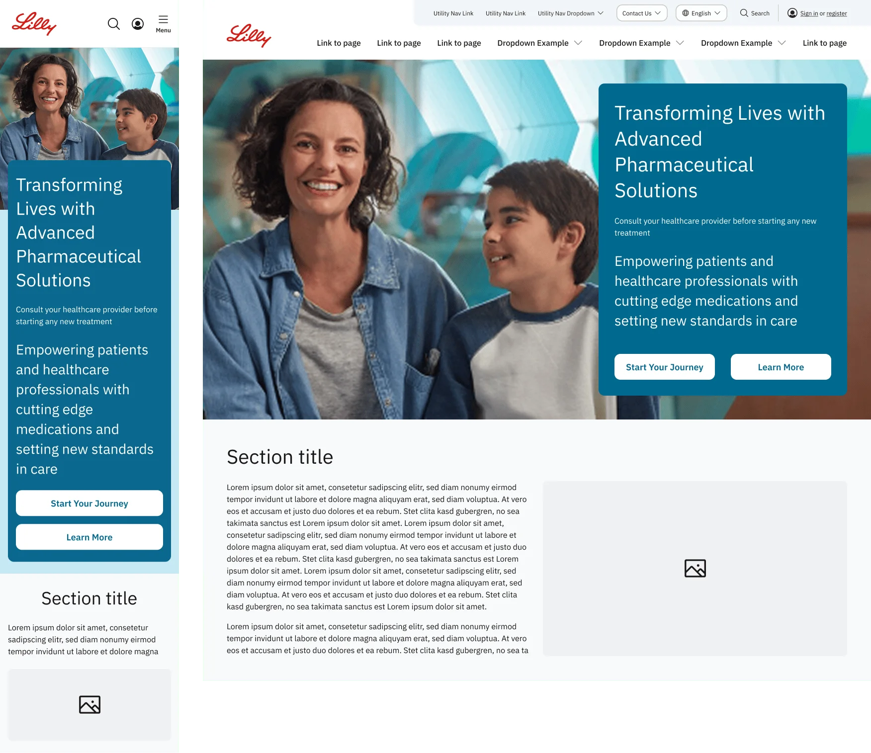
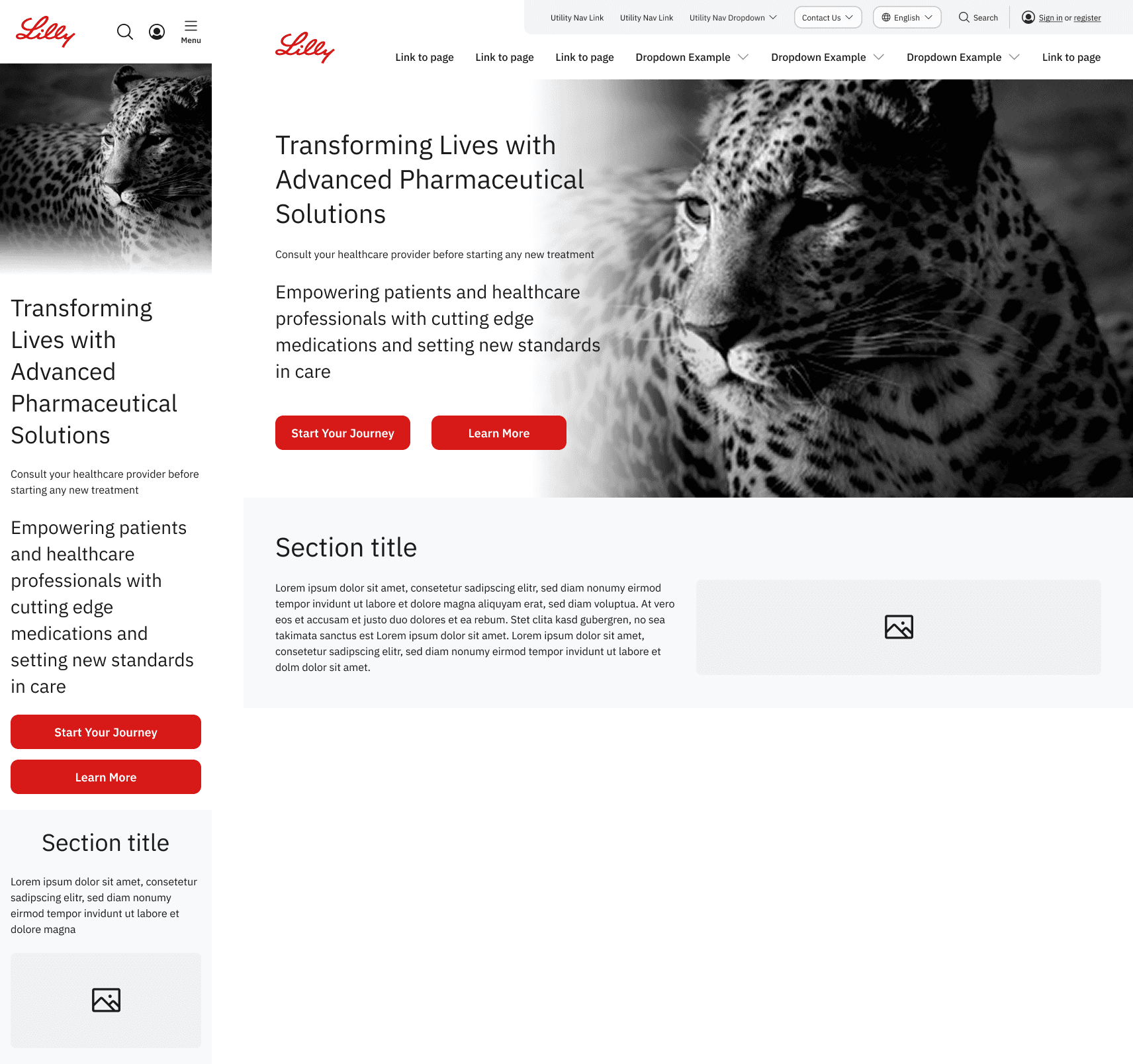
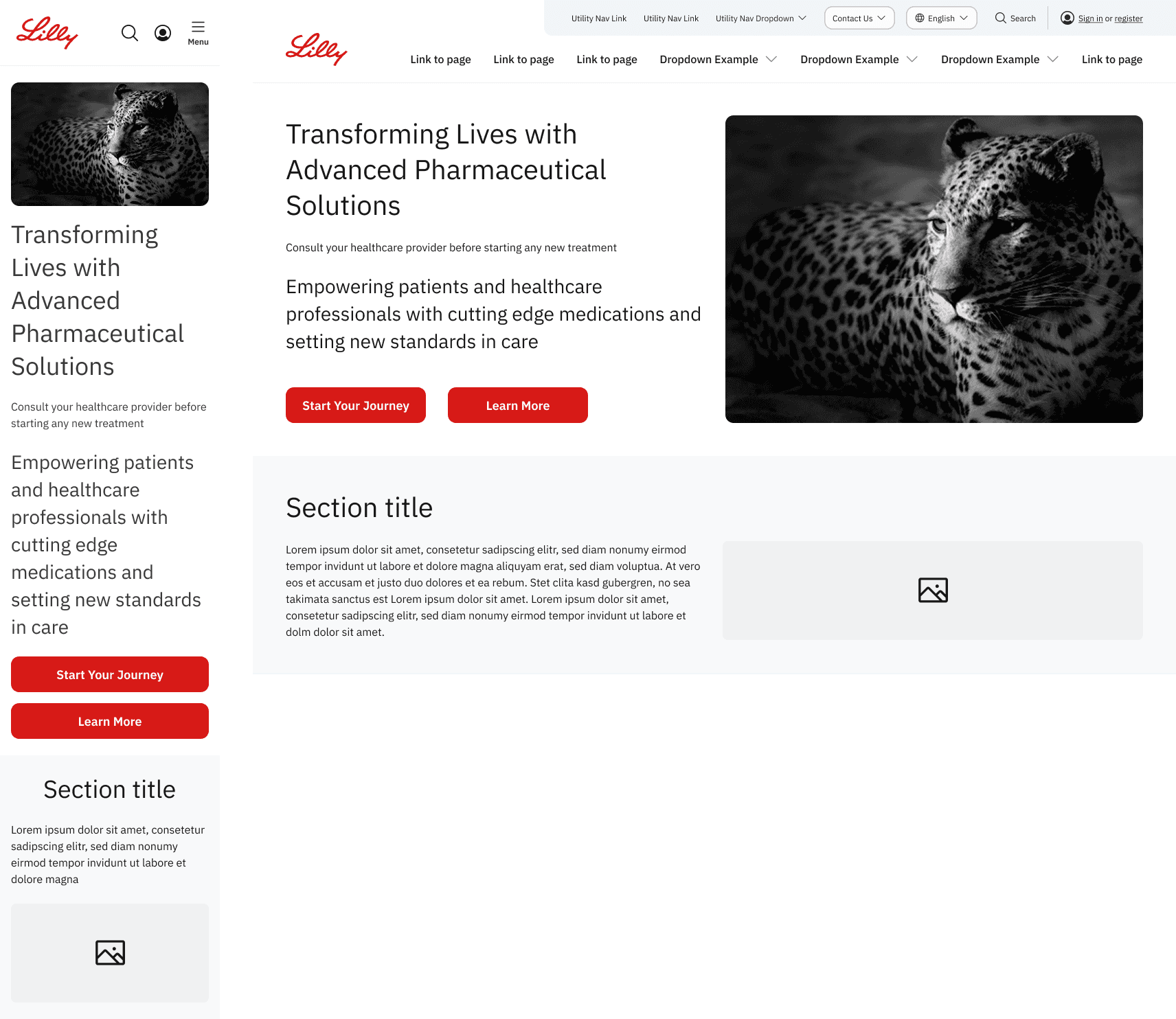
Hero
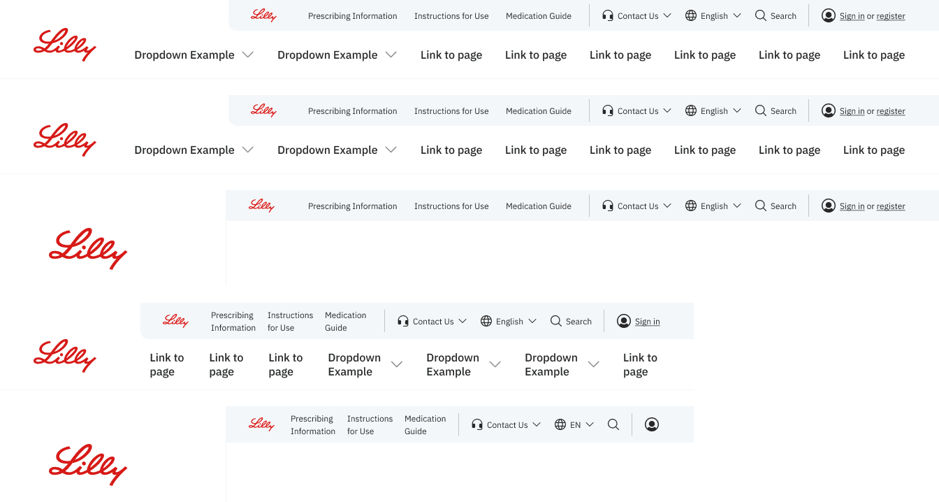
Header/ utility navigation
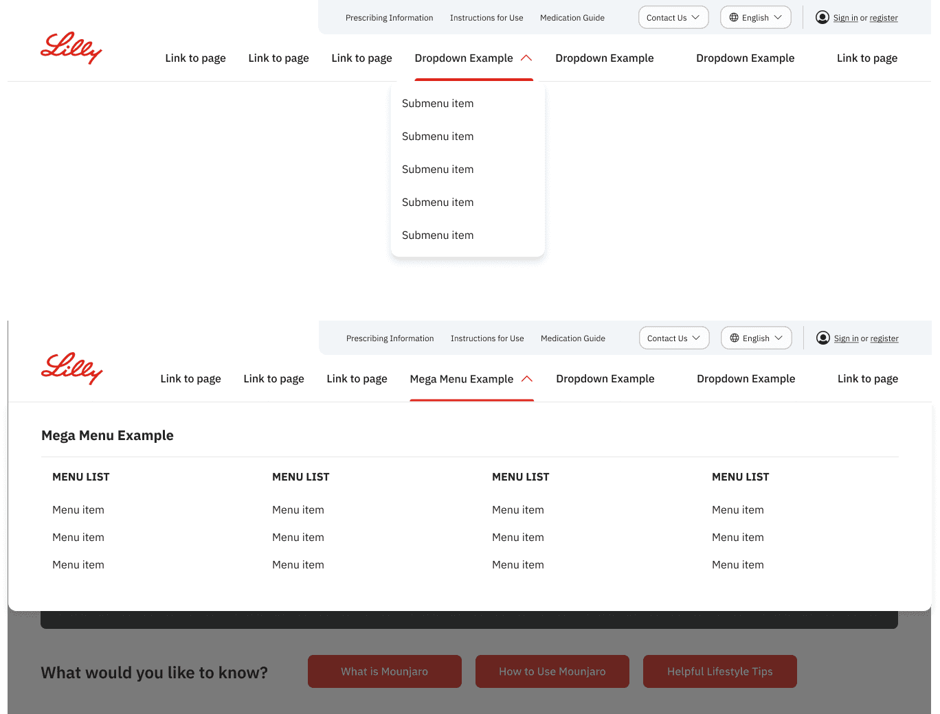
Top Nav
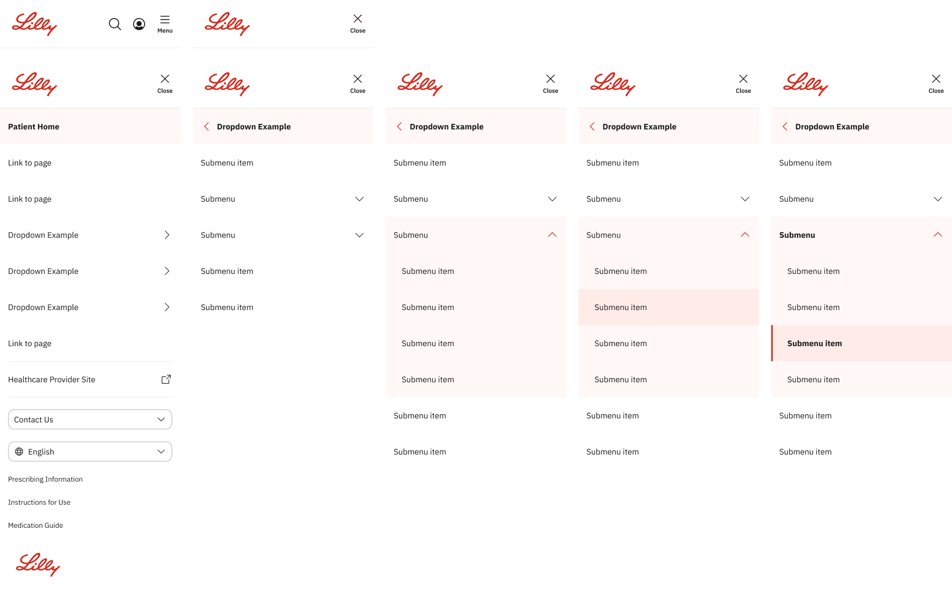
Mobile Nav
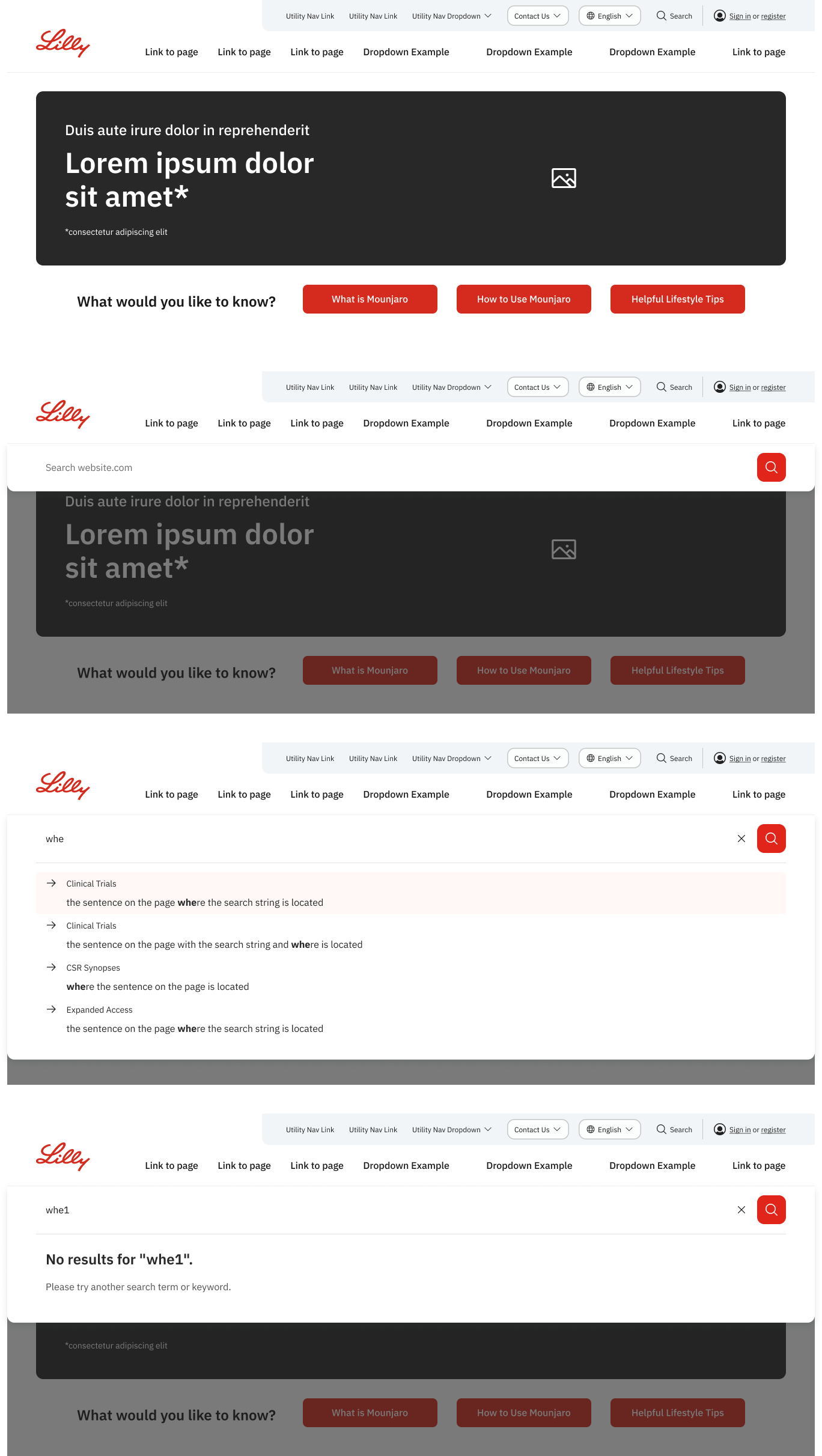
Search
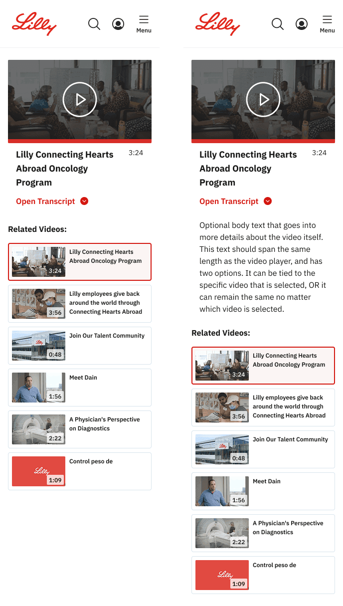
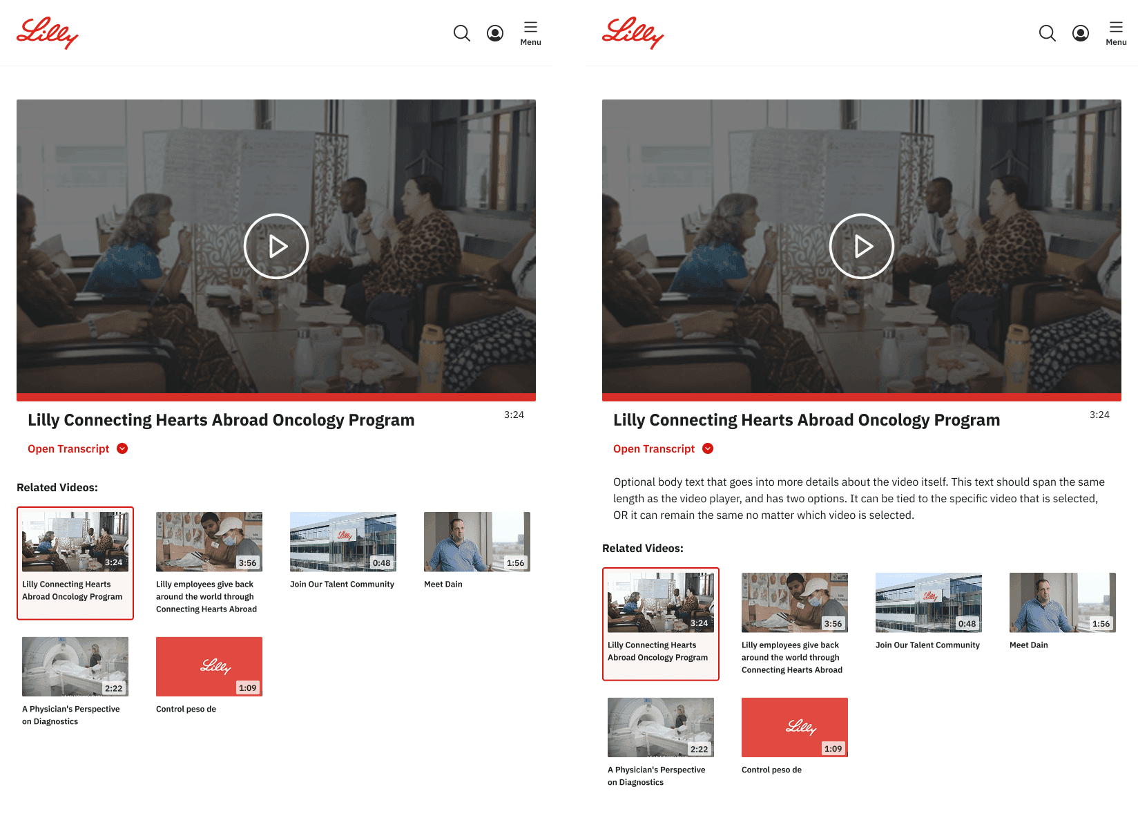

Video player (list)
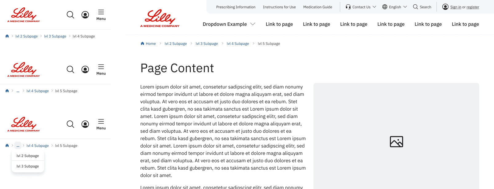
Breadcrumbs
Jumplink
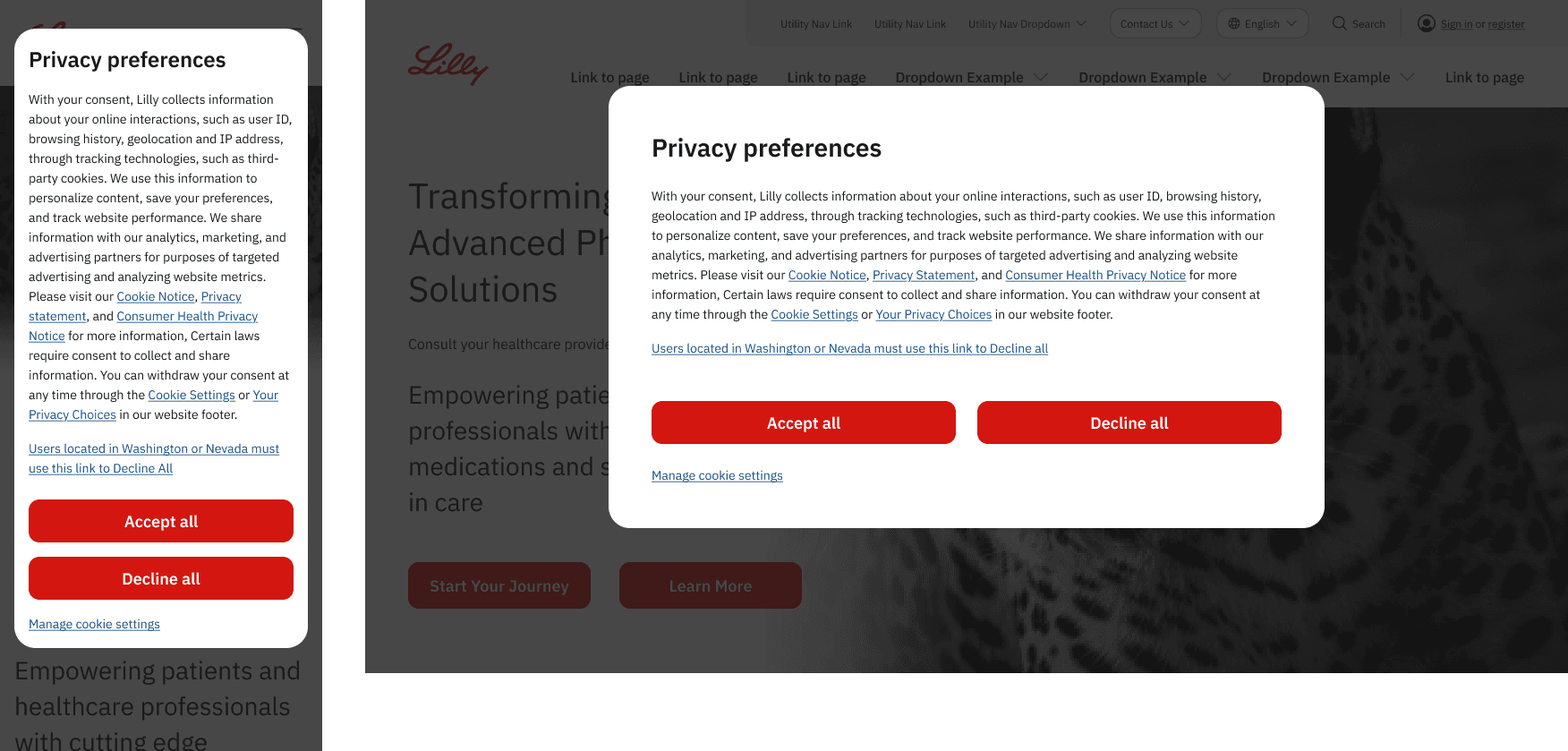
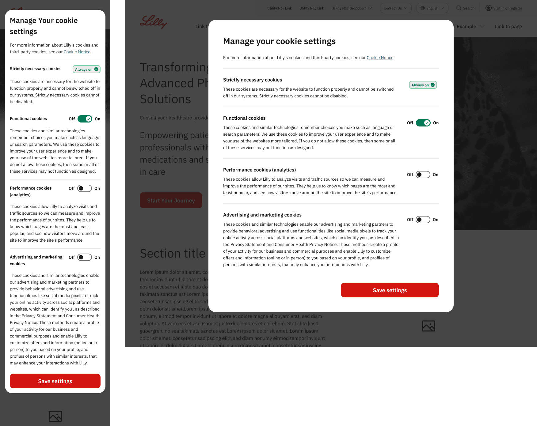
Cookie consent
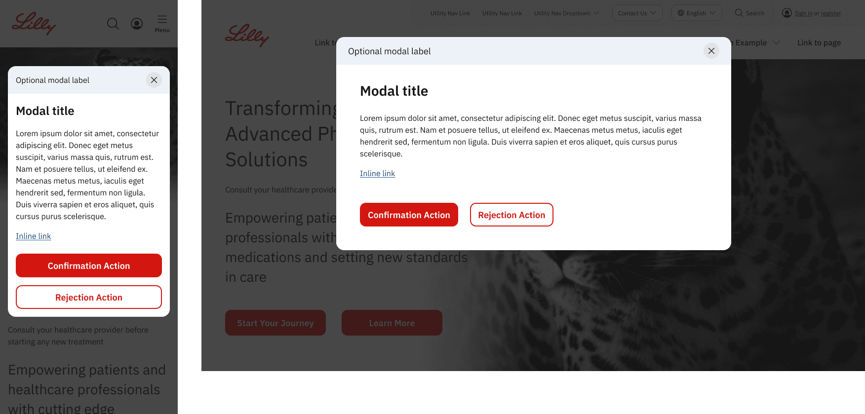
Modal
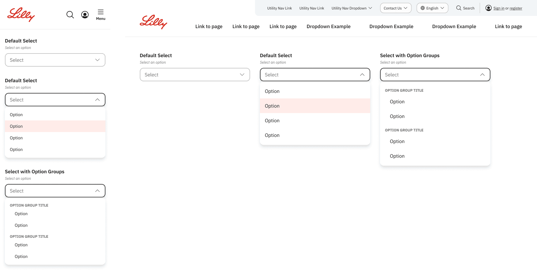
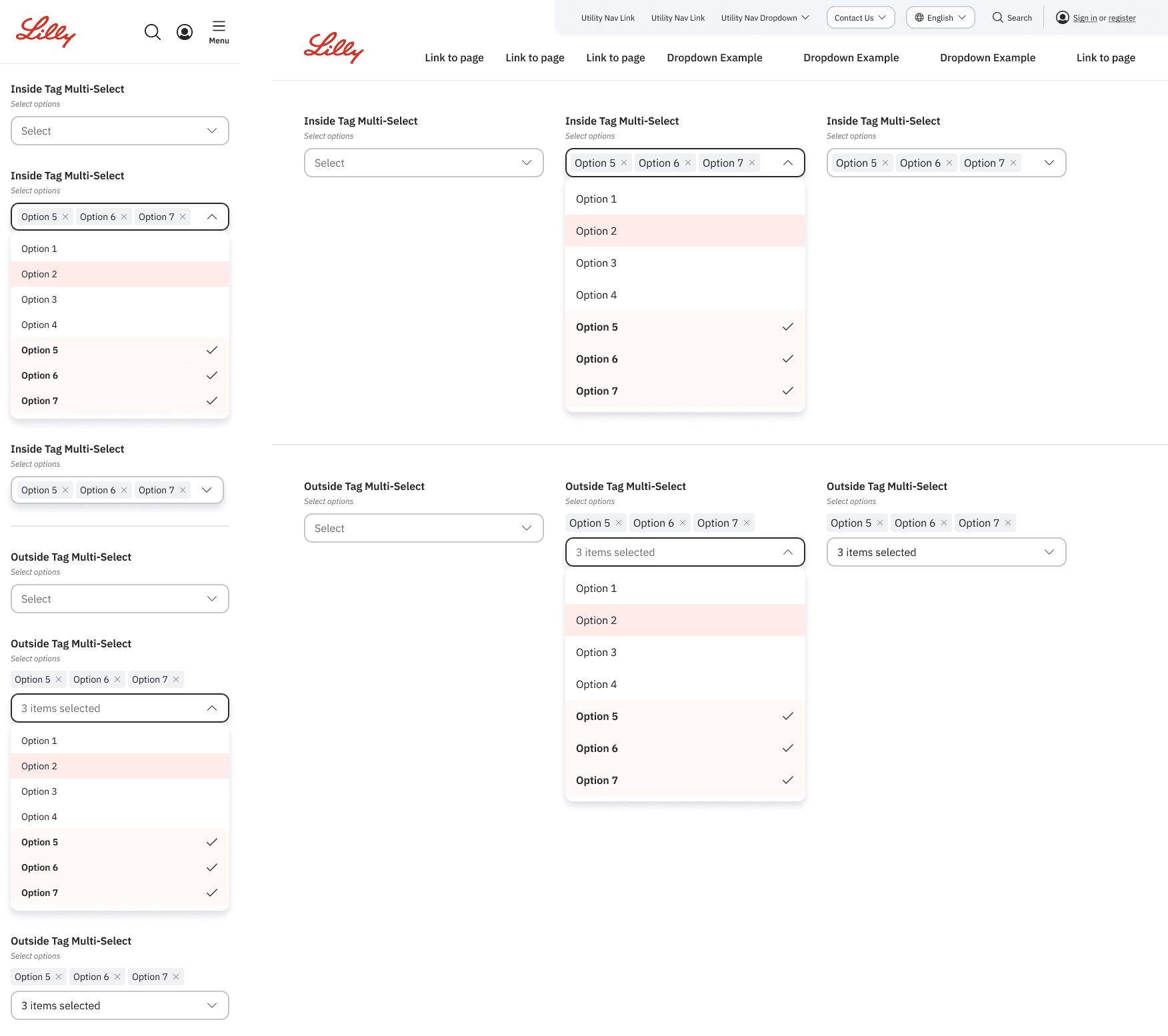
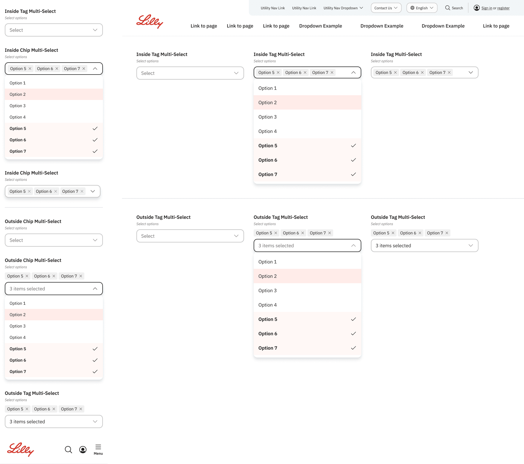
Select/ multi-select